
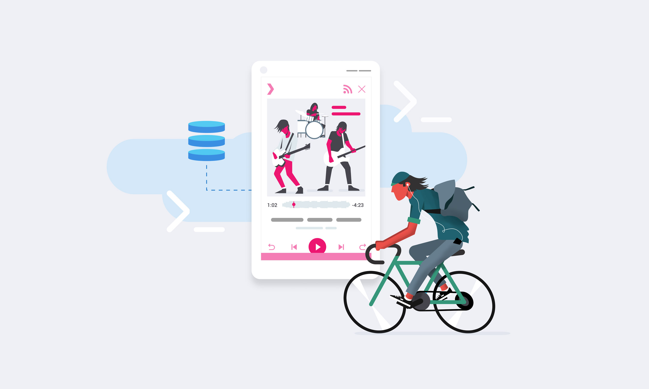
I created a series of illustrations that demonstrate the core functionality or use of the product.


In addition to the characters, I also created a series of hero images that highlighted the locations for various data centers/regions.


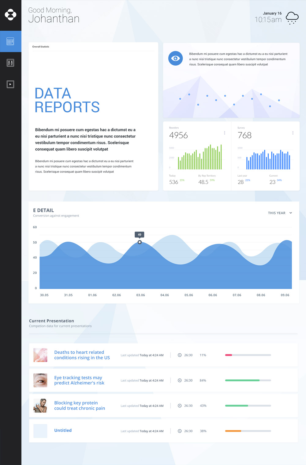
We designed innovative modules so the platform could recommend a presentation that matched data points to the doctor.
By arming the sales reps with focused content, we allowed them to have more informed conversations, which helped build relationships and trust with the physicians.


I created a series of infographics for Merck's team to use internally, to help promote the project to their sales reps.


With new technologies come new deliverables for both design and development. Constant communication is the key to gaining efficiencies and maintaining high-quality output.


I wanted to make the connection between data and human beings while giving the logo an organic feeling that had a sense of movement.


My wife and I—the principals of the print shop—embraced the term “squeegee monkeys” as a way to describe ourselves during the early days of our screen printing, and it just stuck!


For the camping poster, we used silver ink to give the sense of moonglow.


Here are a few of the recent physical and digital releases.


